Brand Identity for an Architecture Studio
Visual identity project for an architecture studio, including logo design, brand guidelines, custom icons and stationery applications.
This project involved the creation of a visual identity for Fundamenta Arquitectura, an architecture studio requiring a brand system that could communicate clarity, professionalism and technical precision. The scope included the development of logo proposals, the final brand design, a usage manual, a custom icon set for web communication and a range of stationery applications.
Project Information
- Project: Brand identity design
- Client: Fundamenta Arquitectura
- Sector: Architecture / Professional Services
- Role: Logo design, visual identity development, brand guidelines, icon design, and stationery applications
- Tools: Illustrator, Photoshop, InDesign
- Year: 2017
The Challenge
The challenge was to create a visual identity for an architecture studio that communicated professionalism, structure and clarity. The system needed to work consistently across logo applications, printed stationery and web communication, while reflecting the precision and order associated with the architectural field.
Services
- Logo design
- Brand guidelines
- Custom icon design
- Stationery system
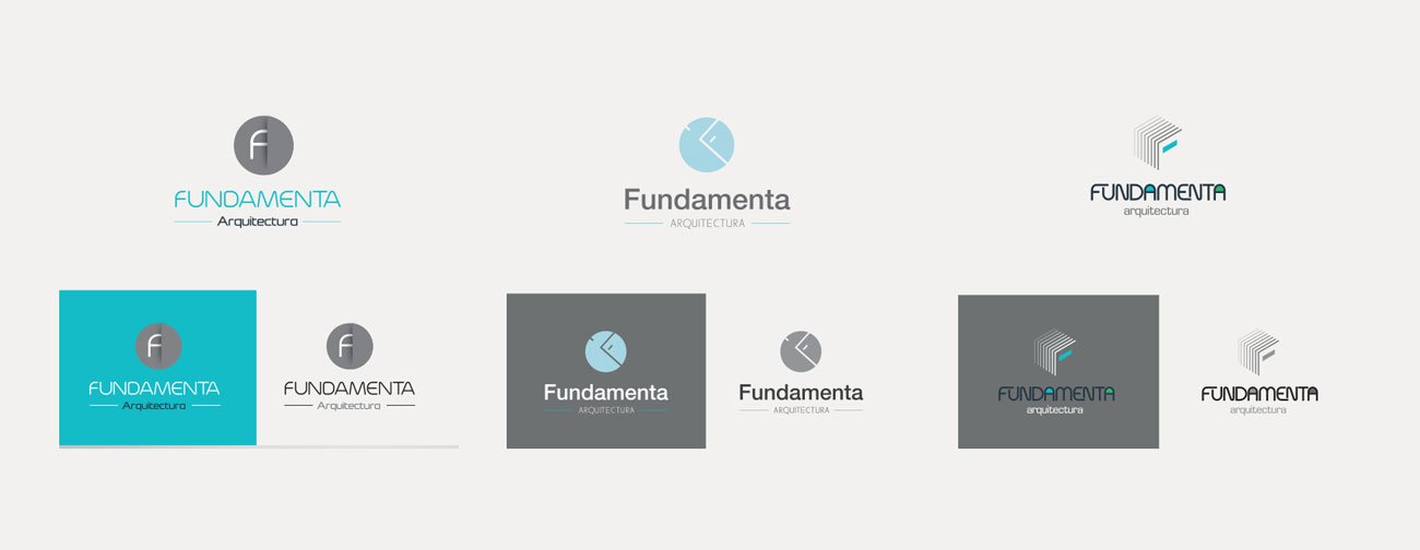
The identity development began with several logo explorations aimed at finding the most appropriate visual language for the studio. Different concepts were tested through variations in symbol construction, typography and composition. This phase made it possible to evaluate how each proposal communicated architectural values such as precision, balance and professionalism before selecting the final direction.
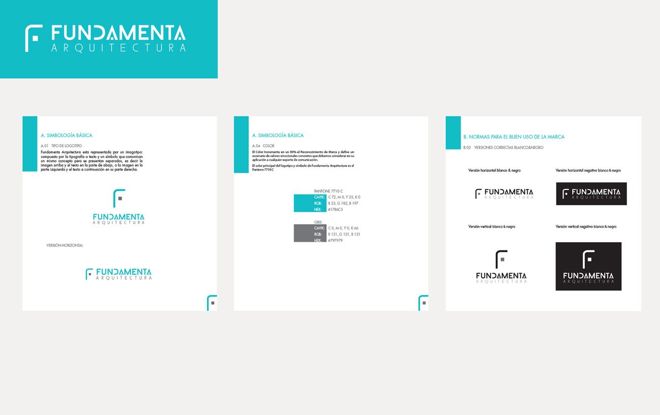
Once the final logo direction was approved, a brand usage manual was developed to ensure consistency across all applications. The guidelines defined logo versions, clear space, minimum size, color palette, typography and correct use in both color and black-and-white formats. This document provided a practical framework for maintaining a coherent visual identity across print and digital media.
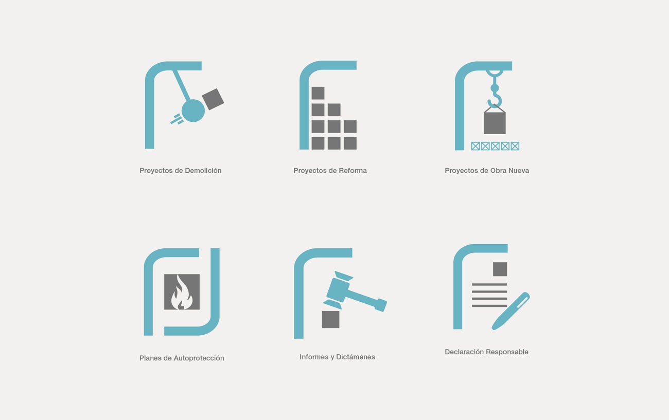
The website icon system was developed to support navigation and communicate key service areas with clarity. Each icon was designed to align with the identity’s visual language, creating a more cohesive and professional digital experience.
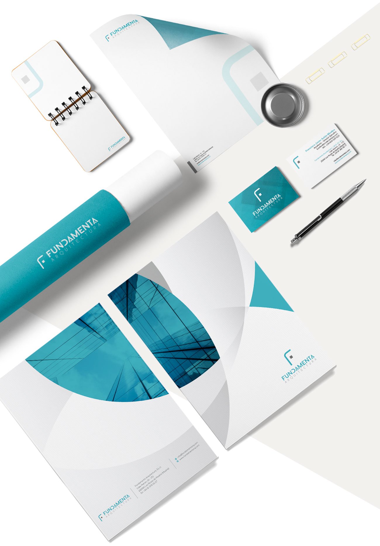
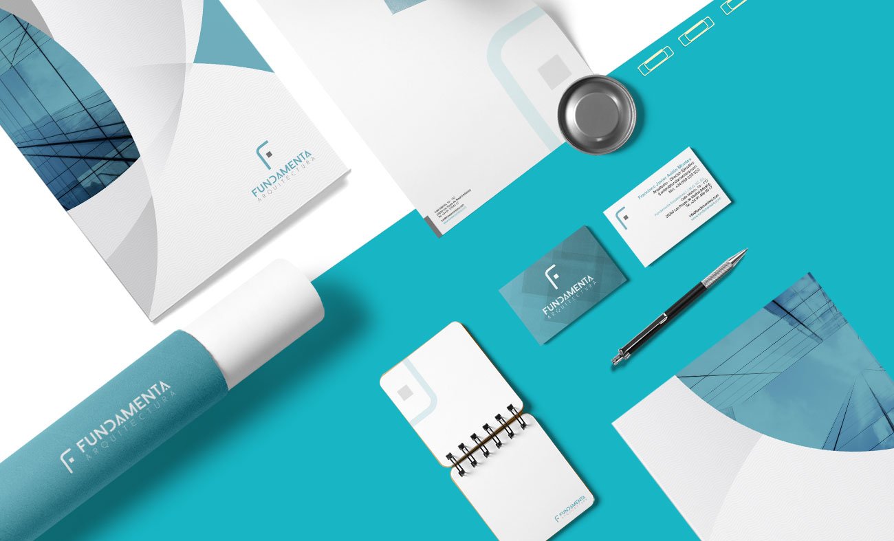
The final identity was applied to a set of corporate materials including business cards, letterhead and presentation stationery. These applications demonstrate how the brand system extends beyond the logo, creating a coherent and professional image across everyday communication materials. The use of color, layout and graphic elements helped reinforce the studio’s visual recognition in both client-facing and internal documents.