Amura Restaurant: Brand Identity Design
Visual identity design for a restaurant, developed through three logo proposals and refined into a final imagotype supported by a corporate identity manual.
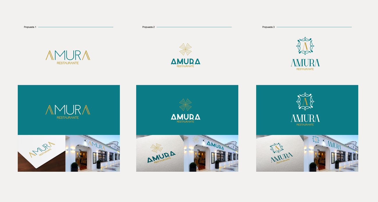
This branding project was developed for Amura, a restaurant in need of a distinctive and elegant visual identity. The process began with three different logo proposals, each exploring a different visual direction. The selected option was Proposal 1, built around a refined typographic solution in which the letter A became the central defining element of the imagotype. The final identity was later organized into a corporate manual to ensure consistency across its applications.
Project Information
- Project: Brand identity design
- Client: Amura Restaurant
- Sector: Restaurant
- Role: Concept development, logo design, imagotype design, and corporate identity manual
- Tools: Illustrator, Photoshop, InDesign
- Year: 2020
The Challenge
The challenge was to create a restaurant identity that felt distinctive, elegant and memorable, while remaining clear and functional across signage, printed materials and future brand applications. The final solution needed to give the restaurant a recognizable visual character and translate its positioning into a strong and coherent imagotype.
Services
- Logo design
- Brand guidelines
- Custom icon design
- Stationery system
The identity process began with three different logo proposals, each exploring a distinct visual language for the restaurant. While one direction focused on a cleaner typographic solution, the others introduced more symbolic and ornamental approaches. This exploration helped define the strongest route for the brand and made it possible to compare clarity, personality and application potential before selecting the final identity.
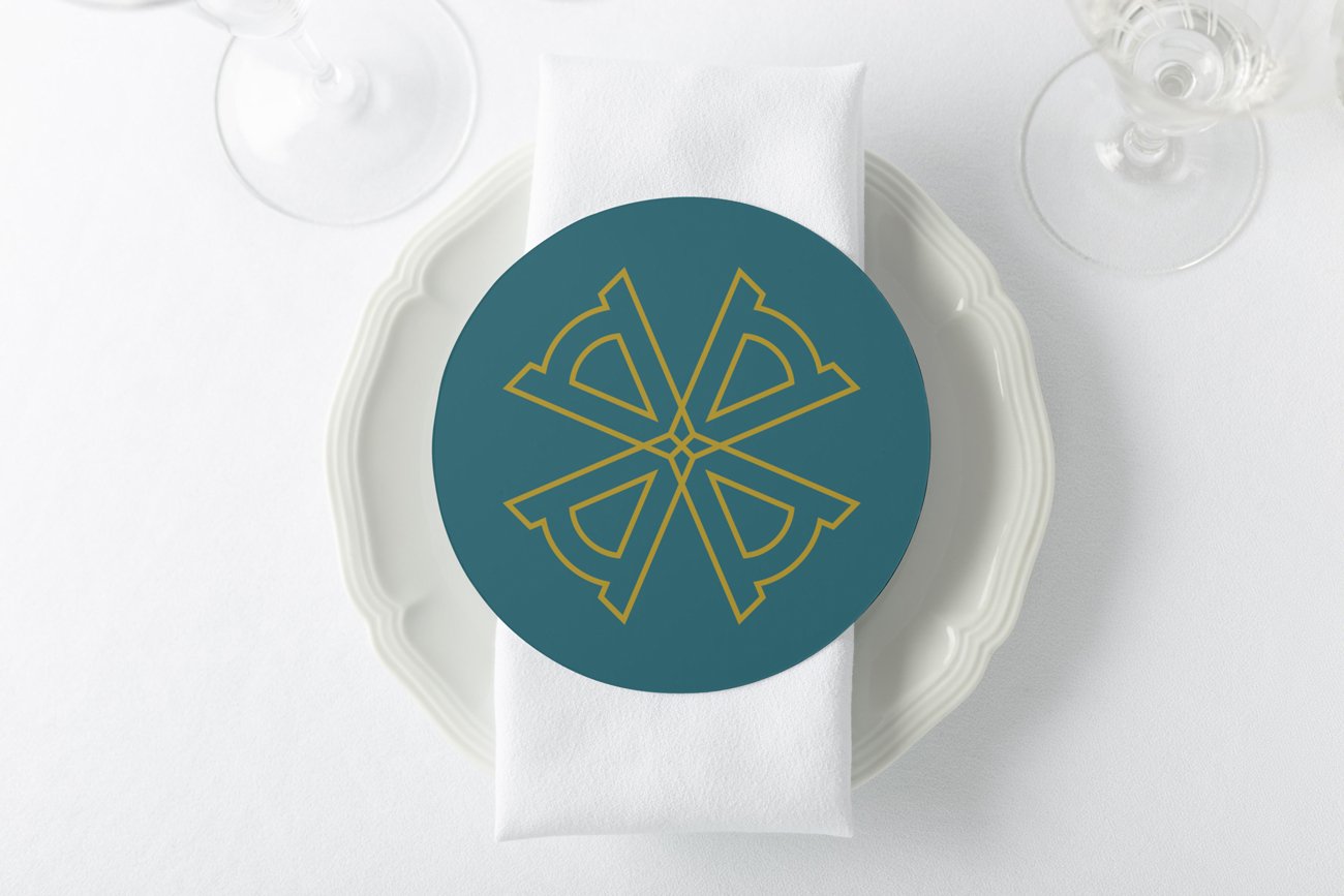
The final identity was resolved as an imagotype, combining name and symbol in a way that reinforced the personality of the restaurant. The letter A became the central visual resource of the system, giving the brand a recognizable graphic rhythm and a more memorable silhouette. This decision helped the logo move beyond a purely descriptive mark and become a stronger brand asset.
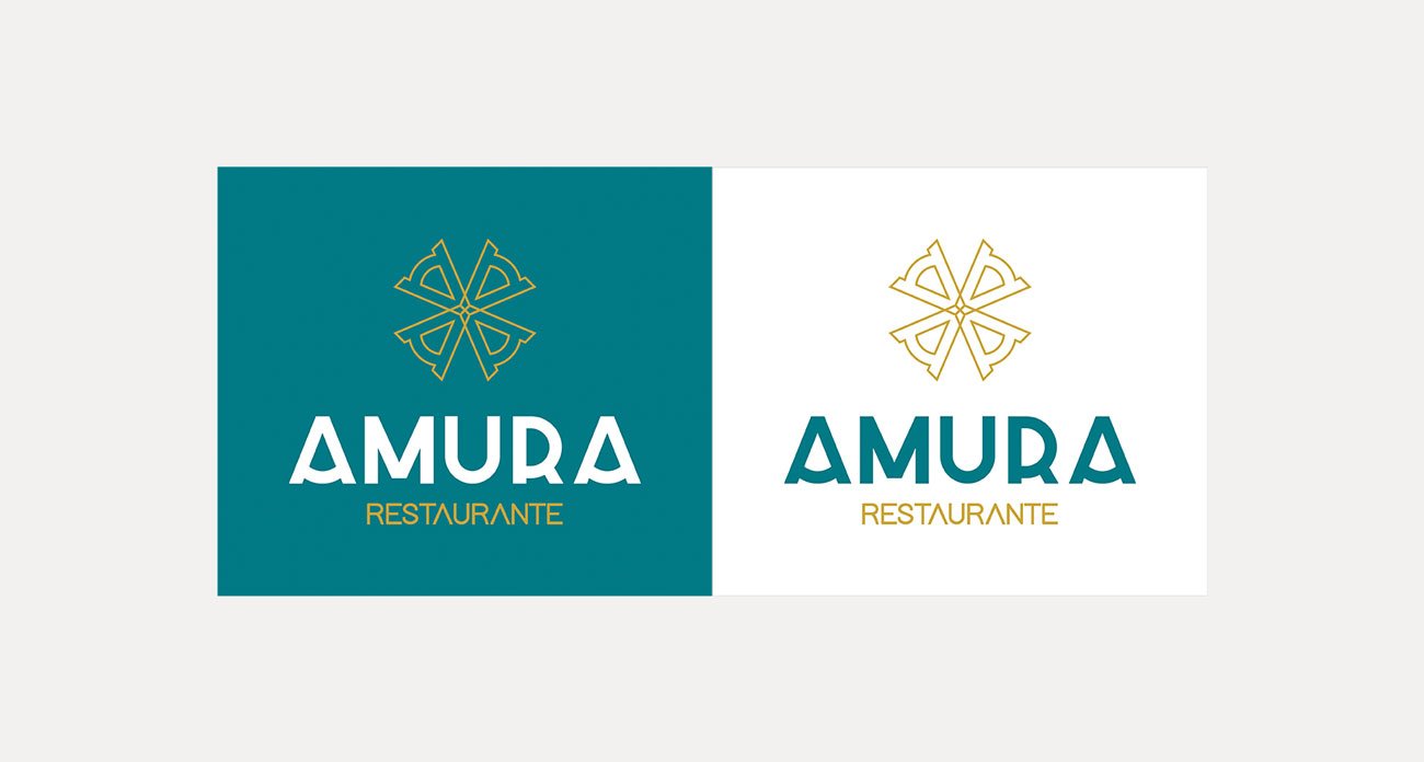
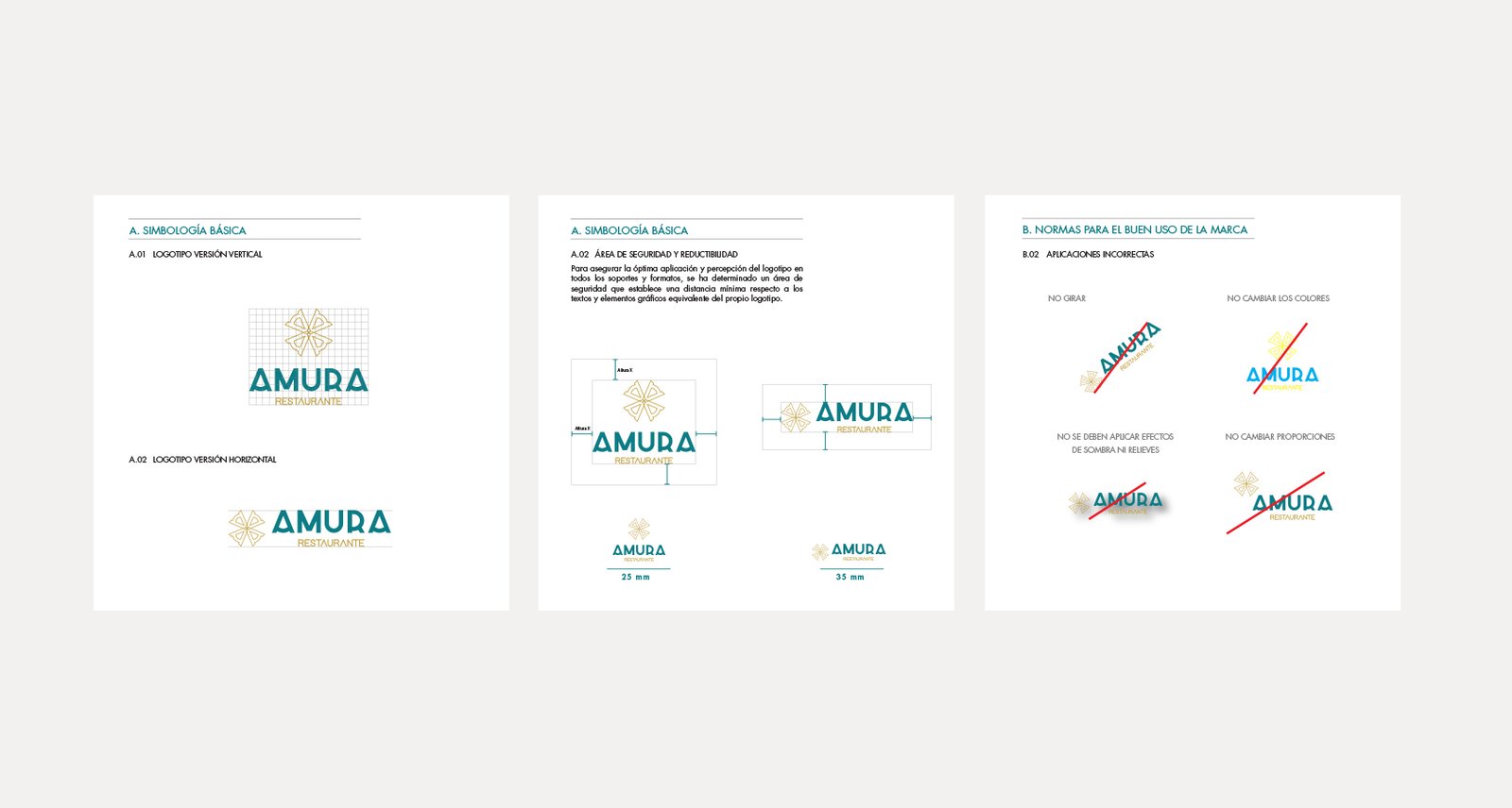
After the final identity was approved, a brand manual was developed to define its correct use across different applications. The guidelines established vertical and horizontal logo versions, clear space, minimum size, corporate colors, typography and correct and incorrect uses. This ensured that the identity could remain consistent and recognizable in every touchpoint.
The color palette combined a deep teal with a warm gold, creating a balance between freshness, sophistication and visibility. This chromatic contrast strengthened the restaurant’s visual presence and helped position the brand with a more refined and contemporary tone.